The brief
The program’s key wording had to read within short durations, across horizontal, vertical and intermediate screen formats.

Client Project / 2024.10
Project story
The program’s key wording had to read within short durations, across horizontal, vertical and intermediate screen formats.
We compared the required text with the running times and proposed a message-led structure instead of a long story. Characters representing artists guided the wording, ending with artists, citizens and the Gyeonggi character together.
The scenes were adapted into eight versions across the required formats, durations and endings.
 Letting the key wording read first
Message first
For Gyeonggi Arts Center, the film focused on the program’s main message through approachable artist and citizen characters, rather than trying to explain the whole policy in a short slot.
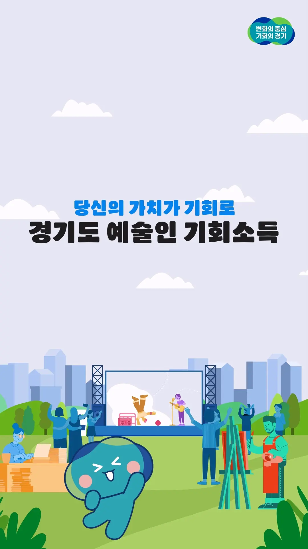 The same priorities in each version
Multi-format
Characters, type and space were recomposed for each screen ratio. Different durations and endings retained the same message hierarchy.
Credits
Start a project
Continue exploring
 Safelife Brand Film